MokuToc
Extracted a documentation template's best feature and shipped it as a standalone Marketplace component
Field | Detail |
|---|---|
Product | MokuToc |
Type | Framer Marketplace Component |
Scope | Product design, component engineering, interaction design, demo content, marketplace listing |
Platform | Framer |
Framework | React + TypeScript, no dependencies |
Marketplace |
Summary
Problem: The table of contents built for MokuDocs 2.0 was the most distinctive part of the template, but it was locked inside a $79 product. Readers of any long page need to know where they are; most tables of contents solve that by taking a permanent column away from the reading width, and on phones they are usually hidden entirely.
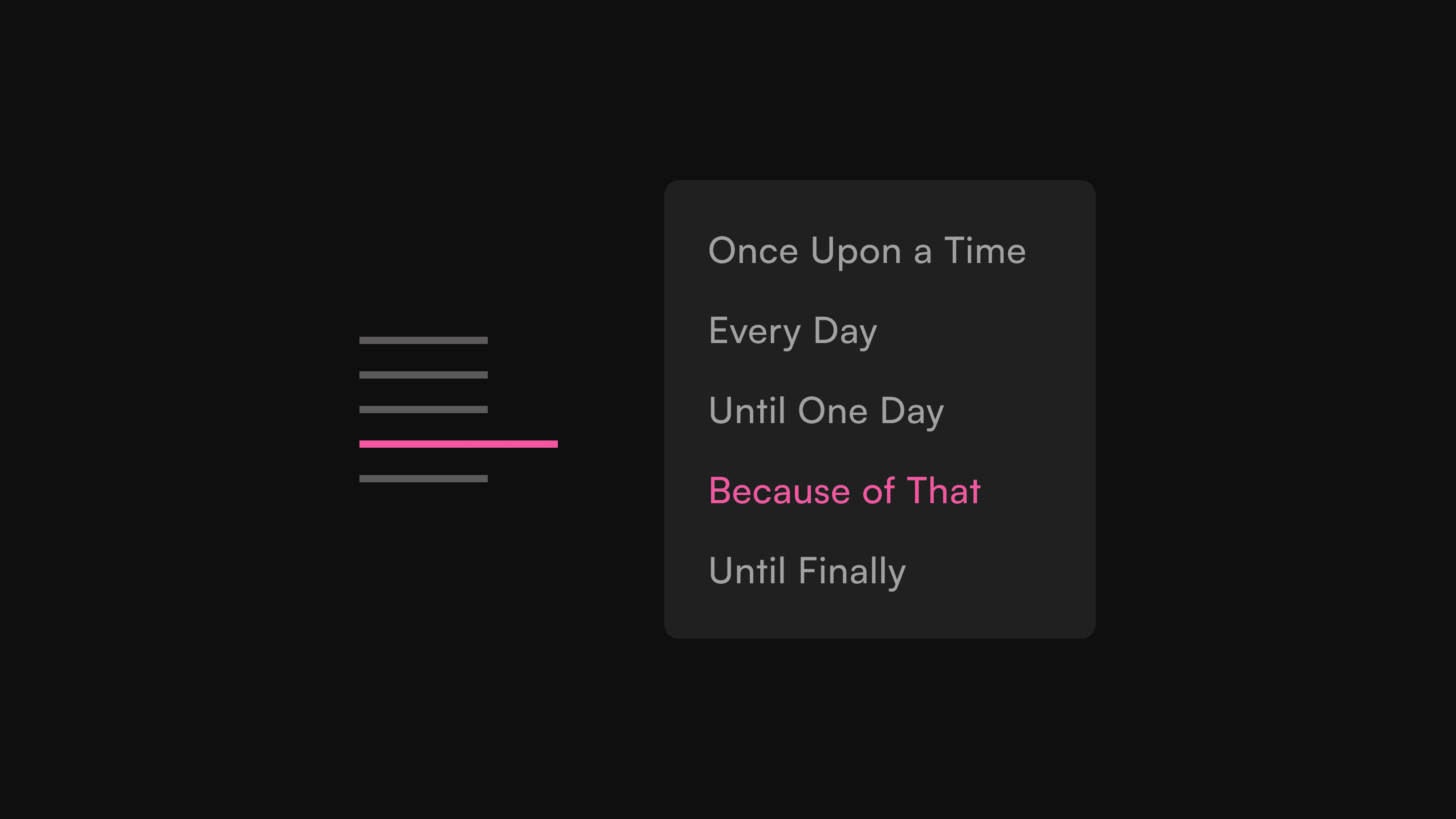
Solution: MokuToc, a standalone Framer component that reads the headings already on a page. On desktop it is a rail of thin dashes that opens a full-list popover on hover. Below a configurable breakpoint the same engine renders a sticky bar naming the current section. Everything a buyer can see is exposed as a property control.
Impact: Extracted, generalised, hardened and listed in roughly three weeks of part-time studio work. Live on the Framer Marketplace at $15, with a public demo, a setup page, and six documented feature shots, on the same day the listing was approved.
Overview
MokuToc began as a feature, not a product. MokuDocs 2.0, the studio's documentation template, needed in-page navigation that did not cost a column, and the answer was a Codex-style dash rail: thin marks at the edge of the content, a popover on reach, the current section held in the accent colour. It read well in reviews of the template, and it kept being the thing worth pointing at.
A table of contents is also a far smaller commitment than a documentation system. A $79 template asks a buyer to restructure how they publish docs. A $15 component asks them to name one layer. Splitting the rail out created a product with a much wider audience at a much lower barrier, and a second entry point into the studio's other work.
Challenge
From feature to product
Inside MokuDocs the rail could make assumptions: it knew the page structure, the header height, the scroll container, the theme system. A marketplace component knows none of that. It has to find headings in whatever structure a buyer built, survive whatever wrappers sit between it and the article, and pick sensible colours on a page it has never seen. The extraction was mostly a process of finding every assumption and replacing it with either detection or a property control.
Framer is a hostile host for a scroll spy
The component's core job is knowing where the reader is, and Framer's hydration makes that hard. The DOM can expose wrappers that look like scroll containers and stop being one a moment later. The article's DOM can be swapped for an identical twin, leaving cached element references measuring a detached tree. A scroll parent resolved once and trusted forever silently broke both the spy and click-to-jump. Every reference had to become re-validated at the moment of use.
One breakpoint, two presentations
A dash rail is meaningless on a phone. The mobile answer is a sticky bar naming the current section, sliding out of the way when the reader scrolls down. The risk in shipping both is drift: two renderers quietly disagreeing about which section is active. The design constraint became a rule: one engine owns heading detection, anchors, the spy and the jump logic, and the breakpoint decides only which presentation consumes that state.
Approach
Read the page, keep no second outline
MokuToc scans a named content layer for H2 and H3 headings, assigns anchor ids, and rebuilds its list whenever the content changes, through a mutation observer scoped to the article, bounded hydration polling, and a heartbeat that catches wholesale DOM swaps. There is no list to maintain: change the copy and the navigation follows.
The rail and the popover
The desktop presentation is deliberately quiet. Dashes are two pixels tall; the active one is longer and takes the accent colour. Hovering or focusing opens a single popover carrying every heading title, bridged to the rail with padding rather than margin so the pointer can cross without the popover collapsing. H3 rows indent only when an H2 actually precedes them on that page.
A bar that respects the header
Below the breakpoint, the bar sticks under the site header and slides to the top of the screen when the reader scrolls down, mirroring how headers themselves hide. Scroll direction drives a CSS transition on the sticky offset. Tapping opens the full list; selecting jumps and closes.
Colours from the page itself
Rather than asking buyers to wire up a theme system, MokuToc samples the rendered background it sits on and derives light or dark from its luminance, with a theme attribute and the operating system preference as fallbacks. Both palettes, ten colours in all, are editable properties.
Everything in the panel
The property surface grew to eight groups: label, heading depth, setup, rail geometry, popover, light theme, dark theme, and mobile. The rule, carried over from MokuGraph, was that a buyer should never need the code. The same rule shaped the support surface: a public demo article with self-made diagrams, and a setup page whose troubleshooting section covers the failure modes buyers actually hit, led by the one that accounts for nearly all of them, a content layer whose name does not match.
Accessibility as a feature, not a checkbox
Each dash is tabbable and focusing one opens the popover. Enter jumps, Escape closes. The mobile bar is a real button carrying aria-expanded, panel entries are real anchors carrying aria-current, and reduced-motion preferences switch off the slides and smooth scrolling. These went into the listing copy as a selling point.
Outcome
Live the same day the assets were finished
MokuToc was submitted and approved on the Framer Marketplace on 23 August 2026, listed at $15 under Navigation with the byline "Minimal table of contents". The launch surface shipped together: listing copy, an 8-second demo recording captured from the live page with a real pointer, a 16:9 cover, six feature shots, a products page entry on the studio site, and checkout copy.
What the extraction taught
The hardest engineering was not the visuals but the environment: trusting nothing about the host page, re-validating every cached reference, and keeping one source of truth behind two renderers. Those patterns, and the discipline of exposing every visible decision as a property control, now form the studio's default playbook for turning a template feature into a standalone component.
In production
The rail this component came from still runs inside MokuDocs 2.0, and the standalone component now navigates its own public demo. The two products point at each other: the template shows the rail in a full system, the component sells it on its own.